Design tokens in 3 layers: how I structured this site’s CSS
Team dark mode? Me too. But implementing it can be one line of code or three months of refactoring. The difference has a name: design tokens.
I just rebuilt the token layer of this very site, so instead of explaining it with made-up examples, I'll open the real CSS of aaronch.dev and walk you through the three layers — what each one is for, and the exact moment all the effort pays for itself.
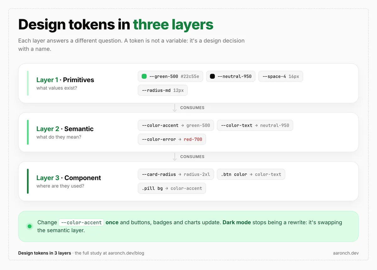
A token is not a CSS variable
A token is not just a variable. It's a design decision with a name. #0c0a09 is a value;
--color-text is a decision: "this is the main text color." The difference feels academic until
you need to change it in 40 places at once.
That's why tokens are organized in layers, and each layer answers a different question:
- Primitives → what values exist?
- Semantic → what do they mean?
- Component → where are they used?
Components don't know about colors — or they shouldn't. They only know the semantic translation. Let's go layer by layer.
Layer 1 · Primitives: what values exist
The raw layer: the full palette, with zero UI meaning. No "brand color" or "error color" here, just facts: this green, this gray, this spacing step.
// src/styles/base/tokens.scss — Layer 1 · Primitives
:root {
  // Neutrals (warm scale, exact values from Figma)
  --neutral-50: #fafafa;
  --neutral-200: #e5e5e5;
  --neutral-500: #737373;
  --neutral-950: #0c0a09;

  // Green accent ("available for projects")
  --green-500: #22c55e;
  --green-800: #166534;

  // Spacing — 4px base scale
  --space-1: 0.25rem; //  4px
  --space-4: 1rem; // 16px
  --space-10: 2.5rem; // 40px

  // Radii
  --radius-md: 0.75rem; // 12px
  --radius-2xl: 2.5rem; // 40px
}
A detail that trips people up: a primitive can be a complete scale even if you don't use every
step. I define --green-50 through --green-950 but only consume three or four. That's fine:
primitives are your palette, not your usage. The discipline comes in the next layer.
Layer 2 · Semantic: what they mean
Here primitives earn a role. --color-text doesn't say "black," it says "the text color."
It's the translation components consume.
// src/styles/base/tokens.scss — Layer 2 · Semantic
:root {
  --color-bg: var(--neutral-50);
  --color-surface: var(--white); // cards
  --color-text: var(--neutral-950);
  --color-border: var(--neutral-200);
  --color-accent: var(--green-500); // the green "available" dot
}
Notice that each semantic token points to a primitive (var(--neutral-950)) — it never
invents a value. And here's the rule that holds the whole system together:
A component never uses a primitive directly, only semantic tokens.
When a button needs its color, it writes var(--color-text), not var(--neutral-950). Sounds
like a minor detail. It's what separates a themeable system from a find & replace across 40 files.
Layer 3 · Component: where they are used
The third layer is optional, which is why it's the most misunderstood. These are component-named tokens that expose a customization API — but always with a semantic fallback. On this site only the card uses it:
// src/app/shared/ui/card/card.scss — Layer 3 · Component
:host {
  padding: var(--card-padding, var(--space-10)); // 40px default
  border-radius: var(--card-radius, var(--radius-2xl)); // 40px default
  background: var(--card-bg, var(--color-surface));
}
The point of the fallback: by default the card uses the system's semantic tokens, but anyone using
it can override --card-padding without touching its CSS. It's a knob, not an exception.
When should you create component tokens? Only when you need that configurable knob. The button,
for instance, consumes semantic tokens directly and has no --button-radius — it doesn't need
one. Multiple token layers aren't over-engineering, but a premature component layer is.
Dark mode is a swap, not a rewrite
This is where the model proves its worth. Dark mode touches neither primitives nor components. It only reassigns the semantic layer:
// The dark variant only rewrites --color-*
@mixin theme-dark {
  --color-bg: var(--neutral-950);
  --color-surface: var(--neutral-900);
  --color-text: var(--neutral-50);
  --color-border: var(--neutral-800);
  // ...primitives and components never notice
}

// 1) Explicit user choice (highest priority)
:root[data-theme='dark'] {
  @include theme-dark;
}

// 2) OS preference, only if the user hasn't chosen
@media (prefers-color-scheme: dark) {
  :root:not([data-theme]) {
    @include theme-dark;
  }
}
A component that wrote var(--color-surface) flips from white to neutral-900 without a single
new line of code. That's the payoff.
And one vocabulary clarification that took me a while to see: theming is not a fourth layer. It's a variant of the semantic layer. Primitives and components are constant across themes; the only thing that moves is the meaning. Think of dark mode as "another layer" and you end up duplicating values; think of it as "reassign the semantic layer" and you end up with this twelve-line mixin.
A real case: adding a state family without touching a component
Enough theory. This is what I did the day before writing this post.
The site had no state colors: the contact form error was painted with --color-text (so it looked
like plain text), and the "message sent" note rode on top of the brand accent. A semantic state
family was missing. I added it in two moves.
First, the missing primitive (the red scale) and its semantic translation:
// Layer 1 — the red scale that didn't exist
--red-400: #f87171;
--red-700: #b91c1c;

// Layer 2 — the role of status messages
--color-error: var(--red-700); // error text — AA on light surfaces
--color-success: var(--green-800);
--color-focus: var(--color-text); // the focus ring, now with a name
One nuance I didn't skip: contrast. --red-700 (#b91c1c) passes WCAG AA as text on light
surfaces; --red-600 doesn't. And in the dark variant the same role uses a lighter value to stay
legible: --color-error: var(--red-400). Same token, different value per theme.
Second, the consumer. The entire form fix was changing one token:
// Before — the error looked like plain text
.contact__error {
  color: var(--color-text);
}

// After — one token, and it's red (and themes itself in dark)
.contact__error {
  color: var(--color-error);
}
That's "change one token and everything updates" made concrete. I didn't hunt a hex across 40 files: I declared a role once, consumed it where it belonged, and dark mode came for free.
The naming mistakes I avoided
Building the layers is half of it; naming them well is the other half. Three traps I nearly fell into:
- A semantic token holding a raw value. I had
--color-text-muted: #6b6b6b— a hex living in the semantic layer instead of pointing to a primitive. I promoted it to--neutral-550and let the semantic token reference it. No semantic token should invent values. - Premature component tokens. It's tempting to create
--button-*,--input-*"just in case." Don't: the component layer is only justified when you need a real configurable knob. - Confusing theming with a layer. We saw it: it's a variant of the semantic layer, not a separate tier.
If you take naming seriously, the best material I know is Nathan Curtis' — his articles on token architecture and naming are gold.
Going deeper
The resources that shaped how I think about this:
- Nathan Curtis — Naming Tokens in Design Systems — the reference on how to name and structure tokens.
- Jina Anne — What Are Design Tokens? (Smashing Podcast) — from the very origin of the concept.
- W3C Design Tokens Community Group — the official spec (first stable version in 2025).
Multiple token layers aren't over-engineering. They're the difference between theming and patching.